The religious tattoo ideas I get asked for are the same handful every year: the Virgin of Guadalupe, a Christ portrait with the crown of thorns, praying hands wrapped in a rosary, a cross or a crucifix, cherubs and archangels, and a line of scripture. Each carries something specific, and most get asked for at half the size they need.
The shop is called Anointed Ink for a reason, and a lot of what comes through the door is faith-led. I am not going to preach at you. What I can tell you is what each image traditionally carries, where the design goes wrong, and what it takes to hold up on skin over the years. Finished work is on the religious pieces page.
The short version
The size column is my own working minimum, not a rule anyone handed me. It is where I have watched these pieces stay readable instead of closing up.
| Imagery | What it traditionally carries | How big I will do it |
|---|---|---|
| Guadalupe, full figure | Protection, home, Mexican Catholic identity | 9 inches minimum, forearm length or more |
| Virgin Mary | Intercession, grief carried well, motherhood | 6 inches for the face to read |
| Christ with thorns | Sacrifice, the Passion | 7 inches, usually a shoulder or half sleeve |
| Praying hands and rosary | Devotion, a prayer you actually keep | 6 inches for the hands, plus the bead run |
| Plain cross | Faith, stated plainly | One of the few that works small, 2 to 3 inches |
| Crucifix with the body | The cost of it, not just the symbol | 5 inches or the figure closes up |
| Cherub | Innocence, watchfulness, often a child | 5 inches for the face |
| Archangel Michael | Protection with a sword in it | 8 inches and up. Wings need room |
| Scripture in script | The line you live by | Sized by letter height, never phrase length |
Guadalupe and the Virgin Mary are not the same request
People use the two names interchangeably and they are different pieces. Guadalupe is a fixed composition. Mary is an open one.
Guadalupe is the image tied to the 1531 apparition at Tepeyac, in what is now northern Mexico City. The composition almost never changes: she stands on a crescent moon, an angel holds her up at the base, rays surround her, her mantle is star-covered, her hands together, her eyes lowered. Because everyone knows the image, everyone notices when you change it. Cut the rays short and you are editing something people know by heart. That tie to heritage is why she so often shares an arm with Aztec and cultural work.
Mary on her own gives you more room. Veiled head, hands in prayer, sometimes a rosary in the fingers, sometimes a single tear. She reads as intercession, and as grief being carried rather than hidden. I tattoo her more for people who lost their mother than for any other reason.
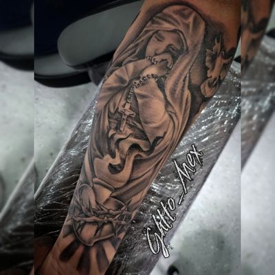
The craft note nobody expects: a Marian piece is mostly cloth. The face is maybe fifteen percent of the work. The rest is folds, and folds are built from value, not line. Flat drape and the whole thing reads like a sticker no matter how good the face is.
Christ portraits and the crown of thorns
A Christ portrait is a portrait first and a religious piece second. If the face does not read as a face, no amount of meaning saves it.
The crown of thorns comes from the Passion accounts, where soldiers plait thorns into a crown (Matthew 27, Mark 15, John 19). On skin it does two jobs. It carries the meaning, and it hands me a hard graphic edge to set against the soft gray wash of the face. Thorns are crisp, the face is smooth, and the eye reads both because they are not competing.
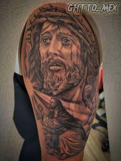
Everything true of portraits is doubled here, because you are not bringing me a photograph. You are bringing a painting somebody already stylized. If the reference is muddy, low contrast, or three images stitched together, you will hear it before we start. My post on picking the reference photo covers what I need to see.
Praying hands, rosaries, crosses and crucifixes
These get grouped because they are usually the same tattoo. Hands, beads, a crucifix at the end of the chain.
The praying hands reference nearly everybody brings traces back to one drawing: Albrecht Durer's 1508 study of an apostle's hands. That is why the pose looks familiar to people who have never seen the original. Hands are as demanding as faces. Knuckles, tendons, the shape of the nails, the gap where the palms do not quite meet. Bad hands read as bad hands immediately, in a way a slightly off face somehow does not.
On rosaries, count the beads. A standard rosary is five decades of ten, a single bead between decades, a centerpiece, then a pendant of five beads (one, then three, then one) down to the crucifix. People who pray it will count what is on your arm, and I have had a client clock a bad count from across the room. If we wrap the chain around a forearm, we decide up front where the crucifix lands, because that is the anchor of the composition.
Cross or crucifix is a real distinction. A cross is the bare form. A crucifix carries the body on it. I will not argue you into either, but pick on purpose. A plain cross is one of the few religious pieces that works at two or three inches. A crucifix is not. Put a full figure on a three-inch cross and in fifteen years it is a smudge with arms.
Cherubs and archangels carry different weight
Cherubs and archangels are not the same thing, and the difference is worth knowing before it is on you permanently.
The winged infant everyone means by "cherub" comes out of Renaissance and Baroque painting. The two leaning on the ledge at the bottom of Raphael's Sistine Madonna, 1512, are the pair the whole world copied. Scripture's cherubim are something else: guardians posted at Eden beside a flaming sword in Genesis 3, and the four-faced beings beneath the throne in Ezekiel. So when you ask me for a cherub, you mean the painting, not the text. Just know which one you are wearing. Cherubs also come to me constantly as memorials for a child, and when that is the reason, say so, because it changes how I build the face.
Archangels are a different mood. Most people who ask want Michael, usually for the same reason: Revelation 12 puts him at the head of the war in heaven against the dragon. Sword raised, often standing over a serpent. He is the one people get after something they had to survive. Gabriel is the messenger of the Annunciation in Luke 1, and in religious art he carries a lily or a horn instead of a blade.
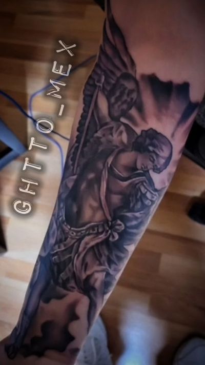
Wings eat space and swords want a long run, which pushes archangels onto forearms, shoulder blades and calves. Squeeze one into a four-inch square and the wings become texture instead of wings. The Michael above is in the gallery with the rest of the religious work.
Scripture: pick the line before you pick the font
The verse and the lettering are two separate decisions and people collapse them into one. Choose the words first, then we size the letters, then we find the spot that fits those letters.
Most requested: Psalm 23, Psalm 91, Proverbs 3:5-6, Philippians 4:13, Isaiah 41:10, Joshua 1:9. The trouble is almost never the verse, it is the length. Someone wants four sentences of Psalm 91 on the inside of a wrist, and there is no version of that still legible in ten years, because ink spreads a little as the years go by and the gaps inside the letters close first.
Two ways out. Cut to the clause that actually matters to you, or tattoo the chapter and verse reference instead of the text. The reference is short, ages cleanly, and quietly requires you to know the passage. My post on sizing script for life has the letter-height math.
A face in gray wash and script beside it are two different tattoos
This is the technical heart of the category, and it is why religious pieces go wrong more often than anything else I do. A portrait and a line of lettering are built by opposite methods, so setting them next to each other is a composition problem, not a decoration problem.
A face is built from value. Soft edges, no hard outline, gray wash packed in layers and worked until the gradient is smooth. What makes it read from six feet is the range between the darkest dark and open skin. Detail only makes it read from six inches.
Script is the opposite. It is built from line weight and negative space, and the gaps between and inside the letters are the actual design. Every one of those gaps narrows over the years, so script gets sized for what it looks like decades out, not for the day I finish it.
Set them side by side and if the lettering sits too close, the soft edge of the face and the spread from the letters meet in the middle and both lose. So I leave deliberate open skin between a face and its script. Clients ask me to fill that gap almost every time. I do not. That space is load-bearing. Same reason my black and grey Chicano realism treats open skin as a design element instead of unfinished area.
Go bigger than you first want to
Nearly every religious piece I book gets asked for at roughly half the size it needs. I am not upselling you. I am telling you what fits.
Count the elements in a Guadalupe: a face, two hands, a star-covered mantle, the folds under it, a border of rays all the way around, an angel at the base, a crescent moon. Seven subjects. At five inches the stars turn into dots, the angel turns into a shape, the folds disappear. At ten inches each element gets to be itself. Same design, completely different tattoo.
Then add time. Every line ends up slightly wider than the day it went in. A design already ninety percent covered at four inches has nowhere to put that. At nine inches it has room to age into. Placement follows the composition, not the reverse: a forearm suits a rosary run or an archangel on the diagonal, a shoulder suits a portrait with a thorn crown. Tell me the image and I will tell you where it goes.
How to bring me an idea
Bring the reference, not the description. "A Jesus piece" tells me nothing. An actual image, a photo of the spot, and anything already tattooed nearby tells me everything.
Tell me what it is for. A cherub for a child you lost gets built differently than a cherub you like the look of. The rate is $150 an hour for larger work (small pieces are quoted flat), a deposit holds the date, and you can start at booking.
And I will tell you when your idea will not work. Psalm 91 in full on a wrist, or a crucifix at two inches, you will hear it before a stencil goes on. Losing a booking bothers me less than putting my name on a piece that falls apart.
Don't be average. Be set apart.
Quick answers
What are the most requested religious tattoo ideas?
The Virgin of Guadalupe, a Christ portrait with the crown of thorns, praying hands wrapped in a rosary, crosses and crucifixes, cherubs and archangels, and scripture in script. Those six cover most of the faith-led work that comes through my door.
How big does a religious tattoo need to be?
A Mary or Christ face needs about 6 to 7 inches to read properly, and a full Guadalupe wants 9 inches or more because it has seven separate elements in it. A plain cross is one of the only religious pieces that genuinely works at 2 to 3 inches.
What is the difference between a cross and a crucifix tattoo?
A cross is the bare form. A crucifix carries the body of Christ on it. Pick on purpose, and know that a crucifix needs at least 5 inches before the figure starts closing up.
Can a portrait and scripture go in the same tattoo?
Yes, but they are built by opposite methods. A face is built from soft value and script is built from line weight and the gaps inside the letters, so I leave deliberate open skin between them instead of filling that space.
Do I need a deposit to book a religious tattoo?
Yes. A deposit holds your date. The shop rate is $150 an hour for larger work, with small pieces quoted as a flat price. Hours are Monday through Saturday, 12pm to 7pm.