Script tattoo lettering fails for one reason more than all the others combined: it was ordered too small. Ink does not stay exactly where the needle put it. Over the years it settles and spreads a little under the skin, so thin strokes thicken and the gaps inside the letters close up. A word you read on my stencil becomes a smudge you squint at from three feet. I have been tattooing over 25 years, and lettering is still the work I turn down most.
Why small lettering closes up
Letters do not need bad line work to blur. They blur because every line gains a little width over time, and small letters have no spare white to give away. Two things go first: the thin strokes, which have nothing in reserve, and the counters.
Counters are the typographer's word for the white enclosed inside a letter: the hole in an "o", the eye of an "e", the loop of a "g". Your eye reads a word by its counters as much as by its outline. Fill them in and the word becomes a shape.
Think in ratios, not sizes. Say a line gains half a millimeter on each side over two decades, and that figure is my estimate, not a measurement. A letter with a 4mm counter still has 3mm of open white and you would never notice. A letter with a 1mm counter is shut. So the question is never how small you can go. It is how much white sits between your strokes, and how much of it you can afford to lose.
Old English, Chicano fine line, and modern calligraphy
These three are not interchangeable and they do not fail the same way. Old English dies in the counters, Chicano fine line dies in the strokes, and modern calligraphy dies in the thins.
Old English (blackletter)
Old English is the tattoo name for blackletter, the heavy upright hand European scribes used before printing. Fat vertical stems, sharp diagonal cuts, almost no white inside the letter. The stems are the most durable thing in lettering because they start out wide. The counters are the least durable: on a proper blackletter "e" the white inside is a sliver. It is also the hardest of the three to read in a long line. Names, single words, years, a short phrase. Not a sentence.
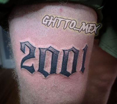
Chicano fine line script
Fine line script is the signature hand of the style and the most fragile thing I put on skin. It came out of Southern California in the 1970s, when single-needle work and thinned-down black that had been done in prisons moved into professional shops in East Los Angeles, at Good Time Charlie's Tattooland, with Charlie Cartwright, Jack Rudy and Freddy Negrete. Same lineage that gives us black and grey Chicano realism. A one-needle line has nothing in reserve, so fine line needs real height and the most honest conversation about word count.
Modern calligraphy and brush script
Heavy downstrokes, hair-thin upstrokes, and the contrast is the whole look. Lose the thins and it stops being calligraphy and turns into wobbly cursive. It holds up longer than fine line and not as long as blackletter.
| Style | What goes first | My minimum | Where it holds |
|---|---|---|---|
| Old English / blackletter | counters close | 3/4 inch (19mm) cap height | forearm, chest, upper back, outer arm |
| Chicano fine line script | strokes thicken and merge | 1/2 inch (13mm) lowercase body, 1 inch caps | forearm, chest, thigh, upper back |
| Modern calligraphy / brush | thin upstrokes fill in | 5/8 inch (16mm) lowercase body | forearm, collarbone, thigh |
Those are my figures, for my hand. Another artist will give you different ones. What does not change is the trade: more letters means smaller letters means a shorter readable life.
Spacing is half the job
Height gets all the attention and spacing decides whether the word survives. Two letters set too close merge into one dark mass long before either letter softens on its own.
- Between letters. One stroke width of open skin at minimum, more when the strokes are thin. Two stems closer than their own width will find each other.
- Between words. A full letter width. In a long quote, tight word spacing kills readability at distance before the letters do.
- Between lines. The tails of the top line (g, y, p) cannot touch the stems of the next (l, h, k). Tangled lines age into a hedge.
- Connections in script. Letters join with a deliberate curve, not a spot where two strokes happen to touch. A touching joint becomes a blot.
This is why I push back on word count. "Only God Can Judge Me" is seventeen letters plus spaces. At a size that lasts, that is two lines filling an inner forearm. Cut it to three words or give it the room.
Where lettering holds and where it does not
Flat, stable skin holds lettering: forearm, chest, upper back, outer bicep, thigh. Skin that folds, stretches or works hard all day does not: fingers, the inner wrist, feet, and long horizontal text across the ribs or stomach.
The forearm is my first choice for a full line of text. Flat, stable, and you can read it yourself. Across the collarbones works for a name if the letters are big. Upper back, outer arm and the front of the thigh all take size, and size is what lettering wants.
Fingers are the hardest surface on the body for lettering. Your hands work every waking hour and the sides of your fingers press together all day. I will do them, and before you sit down I will tell you the work is not going to stay crisp and will want touch-ups. That is the location, not the work. The inner wrist is small, thin-skinned, and exactly where people want the tiniest script, which is the request I turn down most. Ribs and stomach move constantly, so keep text there short and scale it up.
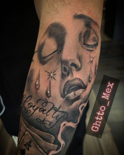
Most of my lettering is not standalone anyway: a banner in a memorial, a name under a portrait, a verse worked into a religious piece. Text next to heavy shading has to be cut larger still, and I leave a margin of untouched skin around a banner on purpose. It looks like wasted space at the appointment and it is what gives the lettering room to stay readable later.
Why freehand lettering is unforgiving
I stencil most lettering and freehand it only when the body demands a curve a flat stencil cannot make. Lettering is the least forgiving thing there is to freehand, because a letter has no tolerance. A face can absorb a stroke that lands a millimeter off its mark. An "R" cannot.
A stencil printed flat and wrapped around a round bicep fights you: the ends pull in, the middle bows, the baseline wanders. So for script that wraps an arm or rides a collarbone, I draw it on with a marker. Then you stand up, we check it in the mirror with your arm hanging the way it actually hangs, and I redraw. That is part of the appointment, not wasted time. What I will not do is needle a freehand quote with no marker stage first.
Check the spelling twice, then check it again
I do not start until you have read the stencil out loud, letter by letter, and told me it is right. Misspelled tattoos do not happen because nobody checked. They happen because everybody assumed somebody else did.
- The exact text, typed out. Something I can copy and paste, in the capitalization you want. Not a screenshot, not handwriting, not "you know the one".
- Names spelled from a document. A birth record, an ID, a headstone. Not from memory. People misspell family names they have said out loud their whole lives.
- A decided date format. 03.14.2009, March 14 2009, and MMIX are three different tattoos. I check Roman numerals twice because they are the easiest thing here to get wrong.
- Another language confirmed by a person. If it is not English, I need it confirmed by somebody who reads and writes it, not by a translation app. Accents change meaning: "papá" and "papa" are not the same word. Hebrew and Arabic read right to left and get mangled when the text is copied wrong.
If you cannot get the text confirmed I will move the appointment rather than guess. I would rather lose the booking than put a permanent typo on you.
What it costs and how to start
My rate is $150 an hour for large and ongoing work, small pieces get a flat quote, and a deposit holds the date. Lettering looks simple, and that does not make it cheap. An even, correctly spaced, correctly sized line is where twenty-five years shows up, and it is the part nobody notices until it is missing.
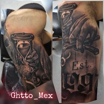
Message me the exact text, where you want it, and whether it should read to you or to the person standing in front of you. I will tell you what size it needs, and if that size does not fit the spot you picked, I will tell you that too. See finished work in the gallery, read pricing and deposits first, and book your date when you are ready. For the style this lettering belongs to, start with Chicano black and grey tattoos, and for timing, read how to book a tattoo with me.
Don't be average. Be set apart. That goes for the words you put on yourself, too.
Quick answers
How small can a script tattoo be?
My floor is about 1/2 inch (13mm) for the lowercase body of Chicano fine line script and about 3/4 inch (19mm) cap height for Old English. Those are my figures for my hand, and another artist will give you different ones.
Why do small lettering tattoos turn into a smudge over time?
Ink settles and spreads slightly under the skin over the years, so every stroke gains a little width. Small letters have no spare white space to give away, so thin strokes merge and the enclosed white inside letters like o, e and g closes up.
Where should I not get lettering?
Fingers are the hardest surface on the body for lettering, and the inner wrist and long horizontal text across the ribs or stomach are close behind. Forearm, chest, upper back, outer arm and thigh hold lettering because that skin is flat and stable.
What is the difference between Old English and Chicano fine line script?
Old English is blackletter: fat stems, sharp diagonal cuts, and very little white inside the letter, so it fails when the counters close. Chicano fine line is the single-needle hand that came out of East Los Angeles in the 1970s, and it fails when the thin strokes thicken and merge.
How do you make sure the spelling is right?
Send the exact text typed out so I can copy and paste it, names spelled from a document rather than memory, a decided date format, and any non-English text confirmed by somebody who reads and writes that language. In the shop you read the stencil out loud before I start.